718cyclery-mockup-tmsite-new.png

718 Cyclery Case Study

UX Academy Capstone 1


Background

718 Cyclery was my first capstone project during my time as a UX Academy student with Designlab.

ROLE: UX Design Student

DURATION: 2 Weeks


Overview

This responsive web design project focused on 718 Cyclery, a Brooklyn-based local bike shop, and the redesign of their responsive website and branding, mainly focusing on the addition of adding bicycles to their e-commerce experience. This redesign emphasized keeping the integrity of the company’s message and demographic, while rethinking their online strategy and customer journey. Total time for this project was two weeks, roughly 85 hours.


undraw_experience_design_eq3j_cAP1.jpg


Research

For this design project I conducted three main methods of research: competitor analysis, interviews, and a survey.

The competitor analysis allowed me to prepare questions for the following research methods as well as understand what strategies competitors are using in terms of targeting a particular demographic and highlighting a unique branding experience.

The interview process involved 3 interviews with participants within the target age range (21-65). I asked the participants detailed questions about whether they prefer shopping online or at a brick & mortar store, what they associate with a bike shop, and what they find important when making important purchases. 


Research Survey and 1:1 Interviews


Screen%2BShot%2B2019-07-22%2Bat%2B12.51.27%2BPM.jpg


The survey I conducted involved 8 questions and received 7 responses from participants. The two-part questionnaire had 8 total questions - 4 were market-related, and 4 were demographic survey questions. I found the most interesting result to be the responses to question 4: How do you typically gather information when looking to buy a specific product? Surprisingly, the responses varied greatly to this question, while many patterns appeared in the majority of the other prompts. It seems that consumers gather advice and information about products from various sources, with the internet and friends/family resources being the most prominent. 

It’s also important to highlight some relevant demographic results. 6 of the participants were female, and 1 was male. Additionally, 6 of the 7 participants live in an urban area, while 1 lives in a suburban area. Finally, all participants identified within the 25-34 age range. 

Summary of Findings: 

  1. Users are concerned with ease of shopping for a bicycle online, such as how returning process or purchase flow would work.

  2. Users gather information about an important purchase from various resources, including word of mouth and via internet research

  3. The first thing that users think of when thinking of a bike shop are crowded, cramped, small spaces, located in small towns.

  4. The main reasons why users might not already own a bike are related to urban living environment: mainly concern for space in a small apartment, fear of biking in a city, and simply not wanting/needing to own one. 

  5. Users value expert opinion when shopping for a specialty product such as a bicycle


undraw_done_checking_ty9a-2_cap1.jpg


Define

The define phase involved an iterative approach of creating a detailed persona, breaking down the product roadmap, creating task and user flows, and defining a sitemap. The iterative process involved creating, testing, and updating each submission until I felt I met the goal of each deliverable.


Persona


My final persona was Sarah; a 27-year old single female living in Astoria, NY with a passion for the environment. Her goal was to find a commuter bike through the 718 Cyclery site that would allow her to avoid the frustrating subway system, use a more eco-friendly mode of transportation, and avoid going to a physical bike shop to make her purchase, which she finds cramped and overwhelming.

Information Architecture


My user flows and sitemap helped pave the way for the next several steps of the process by defining and digging deep into the steps my persona, Sarah, would take to navigate to the appropriate pages on the site to meet her needs and goals.


Design


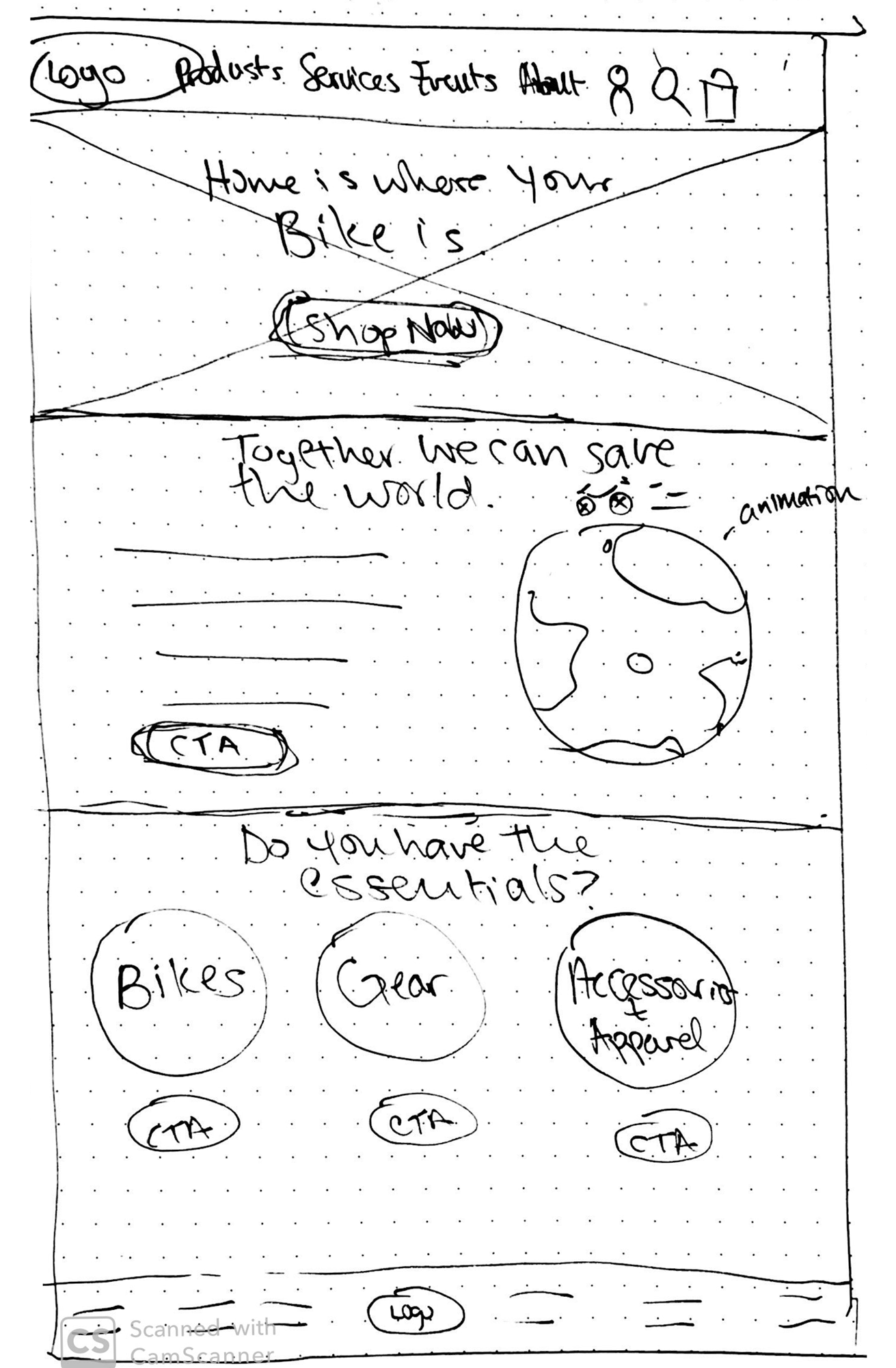
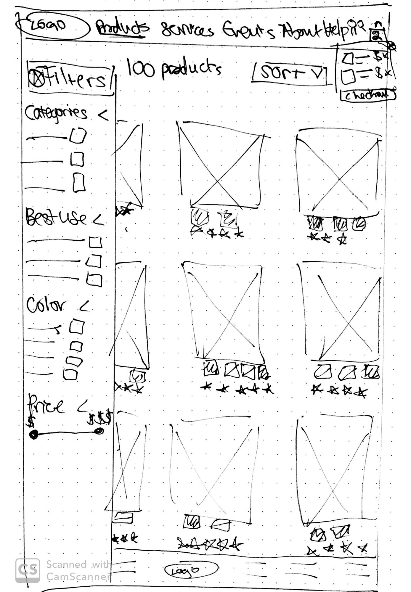
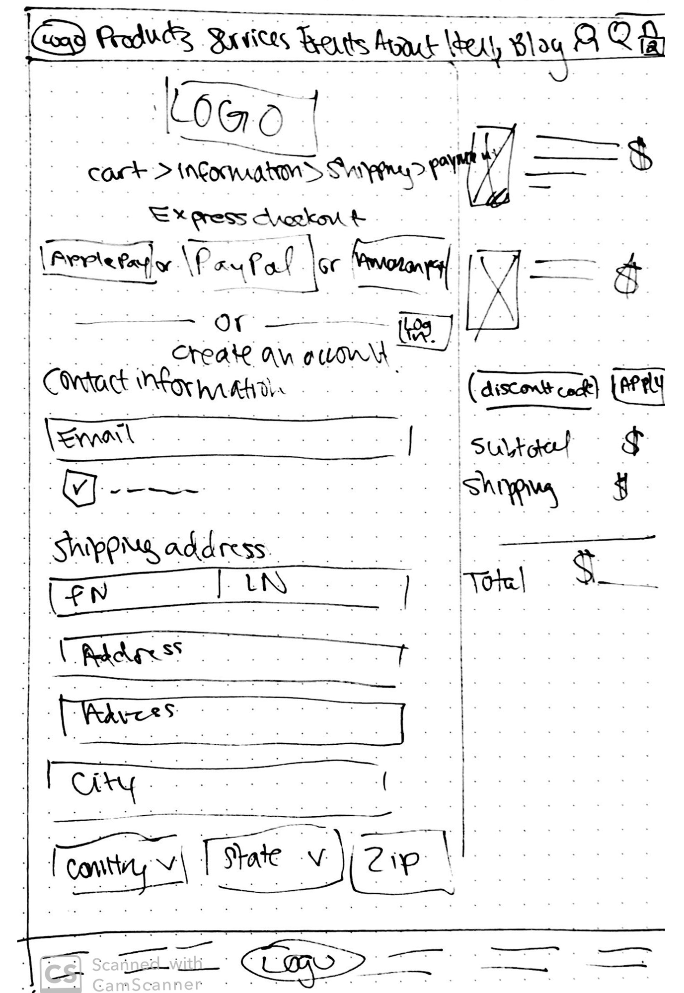
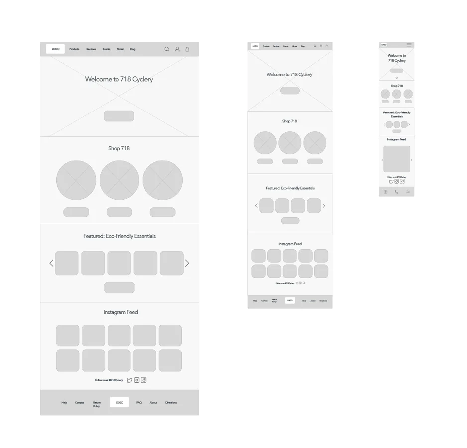
My design process began with creating sketches of my ideas for wireframes until I felt that I had something solid to work with.

Then I moved on to creating those sketches into high-fidelity wireframes in Sketch.


Interaction & UI Design


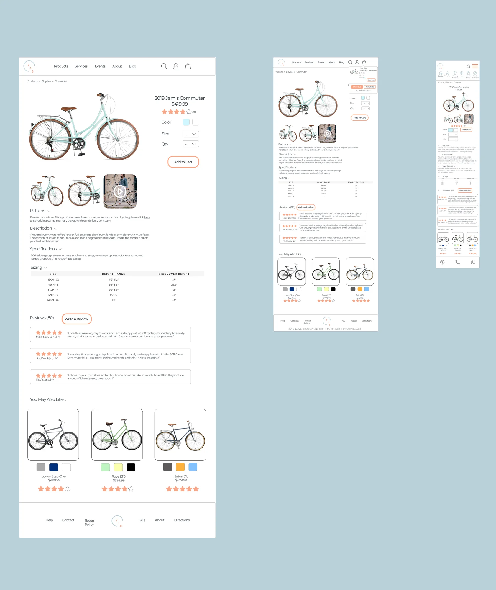
My initial high-fidelity wireframes included 5 unique screens that were crucial for my persona to accomplish her goals while meeting her needs. I then tested my hi-fi wireframes as a prototype in Invision, and made adjustments to the wireframes where needed. Afterwards I created my high-fidelity responsive wireframe designs for 3 of my unique screens on desktop, tablet, and mobile. 


After wireframing I created a moodboard to gather my thoughts and ideas on the new UI design for the site. During this time I also put together a UI requirements document which allowed me to visualize what high-level design needed to be completed and why. 

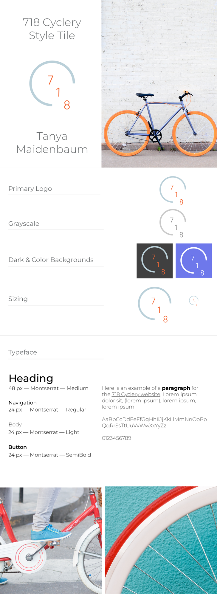
I then jumped right into sketching and creating the new 718 Cyclery brand logo, which I developed first in a sketchbook and then in Adobe Illustrator.


718-Cyclery-Logos-tm-site.jpg


Once this was completed I moved onto putting together a style tile that incorporated all of the elements I gathered thus far. Finally, I wrapped up the design phase by creating hi-fi responsive UI design for the most important screens that met my persona’s goals. 


In this particular project I focused heavily on practicing my UI design skills and am very pleased with how they turned out. I believe that I successfully reimagined the brand’s message and relayed it through the new logo, layout, and customer journey.


Test


To test out my newly created responsive UI designs, I put together two separate prototypes in Invision; one for desktop and one for mobile screens. Prior to testing the visual design I had also tested my wireframes for desktop to make sure I was happy with the flow of the design. 

For testing the visual design of this project I felt it was important to focus on the following points: 

  1. Test the general product purchasing flow on desktop and mobile

  2. Test that the flow on mobile has a similar feel to desktop

  3. Test any errors or roadblocks that a user may come across

  4. Test layout and sizing of design elements and items


I conducted my in-person usability testing on two participants and recorded their interactions with the prototype while I observed. I collected the results from the usability testing and compiled the key findings in a Usability Testing Findings document, as well as an Affinity Map that allowed me to visualize high-priority next steps and revisions. 

Iteration & Implementation

Analyzing the results from usability testing allowed me to go back and iterate on my hi-fi UI designs to ensure that there were no blindspots in the user flow. 


undraw_modern_professional_yt9h_cap1.jpg


Conclusion

In summary, this project allowed me to gain more practice and insight in creating a responsive e-commerce experience, and redesigning a brand’s visual presence and their approach to their current customer journey, while keeping the integrity of their message to customers. I felt that this project was a great example of a hypothetical real-world scenario that I may find myself working on in the future and felt comfortable and excited by it. 


The main challenge I faced was that I realized about halfway into the defining phase that I had not conducted card sorting studies or created an empathy map for this project; I found these methods to be very helpful in previous projects and learned the added values that these methods bring to UX Designing. 


I’m most proud of my growth in visual design skills and look forward to challenging myself further in the research and defining phases of upcoming projects.