Kuoni-mockup-tm-site-new.png

Kuoni Case Study

UX Academy Capstone 2


Background

Kuoni was my second capstone project during my time as a UX Academy student with Designlab.

ROLE: UX Design Student

DURATION: 2 Weeks


Overview

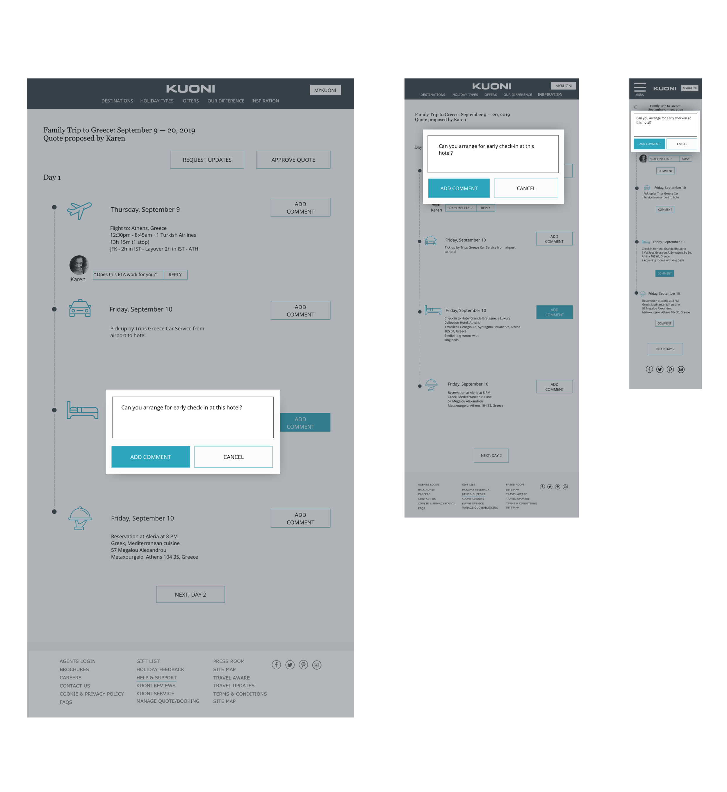
This responsive design project focused on adding a new feature to the Kuoni website, a global travel agency that is well-known for their expertise and the unique experience they offer clients. The project included adding a new interactive feature that allows clients to review, manage, and comment on pending quotes and travel bookings through their site. Adding this new feature required keeping the design and experience of the feature consistent and integral with the current site.


undraw_detailed_examination_joef_cap2.jpg


Research

For the research phase of this project, I first completed competitor analysis that allowed me to survey what patterns and design solutions competing sites are incorporating in their UX. 


Kuoni Ramp Up tm site.png


I created and conducted a survey that collected results from 10 total participants, followed by a card sorting exercise that was completed by 4 participants. The following are brief summaries of outcomes from each method.

Research Survey, Card Sorting, and 1:1 Interviews

The survey was designed to gather information about age demographics, user’s likes and dislikes when booking travel online, and the likelihood of using a service such as Kuoni. 10 participants completed the 9-question survey. 9 out of 10 participants were within the 25-30 age range, and 1 was between the ages of 31-35.

I found the most compelling results to come from questions 5, 7, and 9. In question 5, participants were asked to rate an experience they had with making changes to a travel booking online from 1 (terrible) to 10 (exceptional). None of the participants rated any experience they had a 10. The highest rated given was a 7, rated by 1 participant. The rest of the responses lied between 1-6. 

The survey also included 1 open ended, short answer question - “what is your least favorite part about booking travel plans online?”

The response to this question varied greatly, but mainly focused on feeling frustrated with cancellation policies, comparing prices, making modifications, or generally being unable to find important information or feeling confused by the site. 

The most interesting range of responses came from question 9 - “True or false: I would enjoy the experience of having a travel expert plan an entire trip for me.” Of the 9 participants that responded to this question, 44.4% responded true, 22.2% responded false, and the remaining 33.3% entered their own unique responses, including “In some cases but generally I like the experience of planning,” among two others. 


Screen Shot 2019-09-04 at 4.52.45 PM.png


The card sorting exercise combined key words from Kuoni’s current sitemap, as well as from its direct competitor’s sites. 

4 participants completed the exercise. The median time spent completing the card sort was 3 minutes and 23 seconds. Your participants created a total of 18 categories, with a median of 5 categories each.

The most common groupings occurred within the “types of travel,” “help,” and “account management” categories.

Participants created a range of category titles, including “Where we go” to name the trip information on the site as well as “My Travel Guide” to include “travel documents,” “schedule an appointment” and the various account management-type cards. Some categories were created with much simpler titles such as “book” and “support” or “customer service.”


Screen Shot 2019-09-04 at 4.51.02 PM.png


Summary of Findings:

  1. No participant felt like they have had an exceptional or remotely positive experience when making changes to a travel booking online

  2. Main pain points include users feeling frustrated with cancellation policies, comparing prices, making modifications, or generally being unable to find important information or feeling confused by the site

  3. Users tend to associate the travel agent appointment and inquiry feature with “customer service.”

Opportunities for Improvement:

  1. Emphasize the new bookings and trip management feature to be part of the luxurious Kuoni experience rather than “customer service” or “support”

  2. Make the new feature simple and hassle-free, as well as easy to locate

  3. Encourage users to communicate with a travel agent to minimize technological frustrations and difficulties

  4. Emphasize the idea that “once you use Kuoni, you’ll never book travel without it again” - this addresses the hesitation that some participants expressed with feeling comfortable having a travel expert plan their trips


undraw_options_2fvi_cap2.jpg


Define

Persona, Empathy Map & Storyboard

Incorporating the results from my research, I created a persona that exemplifies the key user pains and gains that appearing in my findings. Sylvia is a mother living in Manhattan with a full-time job. She has decided to book a trip to Greece with her family, but is limited with time to book the trip by herself. She gives the new Kuoni feature a try and requests a quote from a Kuoni travel expert. 

Sylvia has never used a travel agent before, and often is frustrated with not being able to find necessary/helpful information to manage her travel bookings online. This user flow is the flow I have decided to portray and analyze through the rest of the capstone project.

Once the persona was created, I developed an empathy map and storyboard for Sylvia. This allowed me to further understand my persona’s pains and gains, as well as see the product from a user’s perspective. 


Information Architecture

I then put together a product roadmap of any features or details that needed to be added in order for this added feature to work efficiently and consistently with the current Kuoni site. During this time I also researched existing design patterns from various resources to gain inspiration for the new responsive pages I would be designing. 

The creation of the site map followed, which involved adapting the existing Kuoni site map to include the added feature of reviewing and managing bookings from the user profile.  

Finally, I mapped out a task and user flow that I wanted to focus on for the remainder of the project. This process allowed me to hone in on the heart of the project goal and desired result. 


undraw_travel_plans_li01_cap2.jpg


Design

Interaction Design

I kicked off the design phase of my capstone project with putting together a UI requirements document to understand what UI elements I needed to focus on in order to meet my project objectives. Once these were defined, I sketched wireframes in my notebook to get the thoughts flowing in terms of design ideas and pattern implementations.


UI Design

I then put together a brand moodboard on Pinterest to collect thoughts and inspiration for UI design for the new responsive pages. Since this project involved keeping the site nearly identical and consistent with the existing live site, this mainly involved gathering inspiration for patterns and hierarchy rather than any major redesign. 

The next step was to create Low-Fidelity wireframes and then their respective responsive wireframes in Sketch to use as the backbone of my high-fidelity UI design. This took me quite some time to nail down as I knew it would play a major role in my UI design.


Throughout my time as a student with Designlab I have learned the importance of wireframes, and that a great wireframe is the key to successful UI. 

Once I felt that my responsive wireframes were in a good place, I created my style tile, which would later assist me to develop my UI kit. 


Finally, I spent several hours putting together my responsive Hi-Fi UI design, which was the culmination of the research and analysis that I had accomplished in the capstone thus far. With some trial and error as well as guidance from my mentor, I was finally ready to create a prototype in Invision and put my designs to the test with users.


Test


When planning for usability testing, I focused on 5 key testing objectives:

1. Test the customer flow from homepage to pending quote page on desktop

2. Test the usability of the “add comment” feature on the pending quote page

3. Test the navigation to the user profile page

4. Test the navigation to the pending quotes from user profile page

5. Test the reaction from users of using a service like this - is it positive, negative, frustrating, easy, etc?

6. Are users open to using this unique service?


I created a desktop prototype in Invision for the usability testing of my added Kuoni feature. 3 participants were involved in the usability testing; one male, and two females, all between the ages of 26-28. I asked the participants to complete two tasks; the first, to log into their MyKuoni account and open the pending quote located on their profile page. Then, the second task included adding a comment for their travel agent to review and request their updates. Once the tasks were completed, we went over the additional questions about each specific page, as well as the prototype overall.


Kuoni Affinity Map.jpg


Summary of Feedback

1. The added feature felt seamless and easy to use

2. Participants loved the idea of being able to communicate and add a comment on each section; felt this was a useful and helpful addition for clients

3. Completion rate was 100%

4. Pages felt consistent and unified

5. Participants didn't like the inconsistencies in the navigation bars

6. Participants didn’t like the company’s name and didn’t understand what it means; this also included the “MyKuoni” button

Iteration & Implementation

Then followed the creation of an affinity map to help me understand what revisions needed to be prioritized, and finally I updated my UI design to include the high-priority revisions.


undraw_result_5583_cap2.jpg


Conclusion

When adding a new feature to an existing site, ensuring that the pages feel consistent and seamlessly incorporated is key. Finding the right tools that help you do so, such as creating symbols in Sketch or learning to use the Inspection Tool in a browser, is part of the challenge. 


The main challenge for me with rapid prototyping is just that - rapidly prototyping. I struggled with the time constraints of having to complete this capstone in 2 weeks because I have a hard time submitting something that isn’t “presentation ready.” However, with little visual design experience and a strict timeline, I managed to complete this capstone within my projected timeframe.