bhuku-mockups-for-tm-site-v2.jpg

Bhuku Case Study

UX Academy Capstone 3


Background

Bhuku was the third and final capstone project during my time as a UX Design Student with Designlab’s UX Academy. 

ROLE: UX Design Student

DURATION: 2 weeks


bhuku-undraw-illustration-3.jpg


Overview

Bhuku is an app for book lovers that will help users track everything they own, books they have read, what they will read next, and also everything they have loved so far. Bhuku wants to give a more user-centric approach to their app, adding features and flows that make it delightful for people to use. They want to use the full potential that a mobile app has, such as utilizing the camera to register books in a more automated way via optical character recognition (OCR), sending notifications to users to keep them engaged, tracking their progress on reads, etc. Bhuku has “hired” me to design their mobile app on the iOS platform.


Research

Research Survey, Card Sorting & 1:1 Interviews

In order to conduct research for the Bhuku app, I implemented various methods in order to get as much qualitative and quantitative data as possible. I began with market research and competitor analysis, then created and conducted a survey, followed by a card sorting exercise, and finally, 1:1 interviews with participants within the target demographic.


Summary of Findings

  1. The app needs to be easy to use and figure out, as well as fun to use

  2. Reminders or notifications would be generally welcomed if they were purposeful and motivational

  3. Users enjoy receiving suggestions, particularly from family, friends, and colleagues

  4. Many users value ratings and reviews when selecting a book to read

  5. The majority of users read for fun, enjoyment, and/or relaxation; the app experience should reflect these emotions

  6. Bhuku is not just for avid, everyday readers: it’s for anyone who enjoys reading and wants to read more


bhuku-undraw-illustration-1.jpg


Define

Persona, Empathy Map & Storyboard

After gathering the key findings from the research phase, I conceptualized a persona that would represent my ideal user’s goals and needs. 

Kate is a 27-year-old New Yorker with a full-time job who is passionate about reading, but cannot find time in her busy schedule to read for pleasure. She has tried other reading tracking apps before but find them to be confusing and frustrating. She also tends to lose patience and the sense of urgency from daily app reminders, but would appreciate them more if they were more motivational reminders rather than simple notifications. 

Once I was able to conceptualize the persona, empathy map, and storyboard in detail, I was able to paint a picture of what Kate would need in order to fulfill her goal of finding books to read, track her reading progress, make time in her schedule to read, and staying motivated with encouragement from friends or family through book clubs.


This storyboard was the first I ever attempted to sketch and draw out myself, which was both daunting and liberating. I pushed myself to go outside my comfort zone of photographs or illustrations and created these sketches that represent a day in Kate’s life where she decides to download and use Bhuku for the first time.


Design

Information Architecture

The IA phase of this project involved many parts. I first created a product roadmap, which allowed me to visualize all the necessary features that would need to be included in my design in order to “launch” the product. Then I created an app map to sort out how I will group and categorize the sections of the Bhuku app, largely based on my user research findings and competitor analysis. 

I then created a user flow that allowed me to visualize all of the potential paths Kate could take while searching for a book to read and navigating through the Bhuku app. My flow for Kate involved creating an account, setting up preferences, finding a book to read, creating her first list, managing notification preferences, and signing out. 

The next step was to research design patterns of competing apps as well as similarly functioning apps. My main sources of inspiration for this were the Goodreads app and the Blinkist app. To wrap up all of my findings thus far, I created a UI requirements document that detailed all of the essential screens and flows I would need to design in order to meet Kate’s goals and basic needs. 


design patterns bhuku tm site.png


Branding & Logo Design

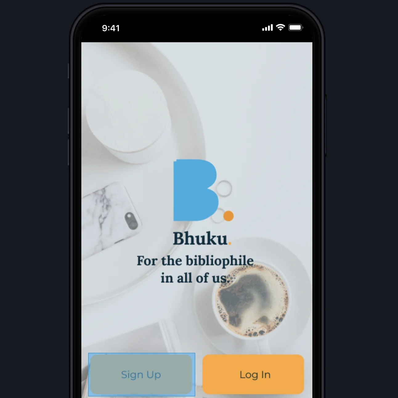
Since Bhuku was a brand new app, I also designed their new logo and defined their branding. The key words I focused on for this were “fun,” “mindful,” “relaxing,” “motivational,” “enjoyment,” “clean,” and stimulating.” 

I began by creating a color palette based on these keywords and sketching iterations of logos that I believe represent Bhuku nicely. I wanted the logo to incorporate a book into the design and an accentuated period (perhaps one of the most important elements of punctuation, of course!) and settled on the final logo design you will see in my UI design. 


Bhuku-logo-tm-site.png


UI Design

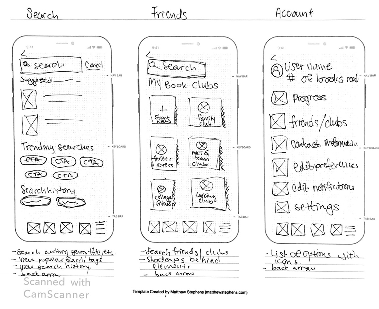
The extensive UI design process first involved culminating my inspiration & ideas into a moodboard on Pinterest. Then, I drew out sketches of each screen that I detailed in my UI requirements document. I then worked on putting together a style tile that would guide me when creating the screens. 


Once I finalized my style tile, I put together my Lo-Fidelity wireframes for each screen. As I’ve learned throughout this process, consistent and strong wireframes are the foundation of great UI, so I made sure to carefully put together the wireframes before moving on to any other phase.


After creating my mobile wireframes, I created my Hi-Fidelity UI screens in Figma. This process took several days as I really wanted to focus on consistency as well as the widely-used iOS industry design guidelines. I wanted the app to feel familiar as well as fun to users.


Finally, I created a comprehensive UI kit once I defined all the style elements and components in my designs.


Test

Conducting Usability Testing


To test my Bhuku app, I created a prototype through Invision and enlisted 3 participants to complete two tasks in full and answer several specific questions about the screens in the prototype. In order to come up with a plan for testing, I had put together a Usability Testing Plan that included a script as well as specific questions prior to the 1:1 appointments with the participants. The usability tests were conducted through Google Hangouts or Zoom where the participant shared their screen and described their actions. General feedback was positive and the test completion rate was 100%.

Summary of Feedback

  1. UI Design was received positively and was described as “clean,” “modern,” and “familiar”

  2. Color palette was effective in highlighting CTA’s and hierarchy

  3. Layout and flow was well-received

  4. Users suggested added more options to the notification settings page

  5. Users had a hard time navigating the search page through the prototype


Iteration & Implementation

After reviewing the key findings of my usability testing, I put together an affinity map that would help me with visualizing what to prioritize in my next steps. I then updated my Hi-Fi UI to incorporate these revisions and updated my prototype.


bhuku-undraw-illustration-4.jpg


Conclusion

The more research methods you are able to incorporate in your process, the better the outcome. I’ve learned that when given the opportunity, use as many methods and gather as many participants as possible, because the findings will be greater and stronger in return.


Stepping out of your comfort zone in any aspect is essential for growth. Even if it is as simple as relying on your own drawings and gaining the confidence to present them, this confidence in your designs will allow you to grow as a designer.


Have faith in the process, and try new methods until you find the ones that work for you. It took me many attempts but I finally feel like I’ve found the rhythm that suits my UX process.